Edward Barber and Jay Rosgerby of the London firm Barberosgerby spoke on the second day of the Design Indaba.
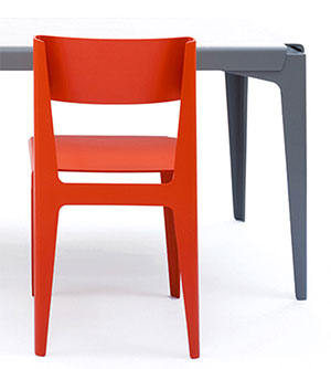
They typify the kind of design I used to think Design Indaba was about: minimal re-articulations of chairs, sofas, lamps and vases. However, they surprised me after all. They shared their journey from restrained and pure shape to the ecstatic use of colour. Firstly they showed us some of the furniture they are famous for. These were tables and chairs made of carefully bent aluminium and plywood. The focus is on truth to material and all distracting details such as pattern, texture and colour have been kept to a minimum:
image from barberosgerby.com
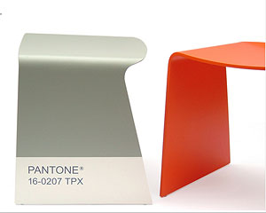
We saw quite a few examples of this type of design. But then something interesting happened. They designed the “Flight Stool” for the International Contemporary Furniture Fair in New York. Each chair was coded according to a particular Pantone shade.
image from barberosgerby.com
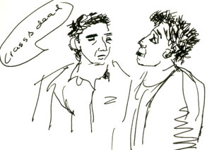
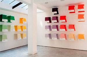
There were 96 chairs and they were exhibited on the walls of a gallery. But now Barber and Rosgerby came up against an interesting problem. If they simply placed the chairs randomly, as they tried to at first, it looked, in their own words “crass and dead”.
They needed to arrange the chairs according to their colours in order for them to come to rights.
image from barberosgerby.com
This introduced them to a new aspect of design – that of colour and colour combinations. “It became a fascination”.
They worked on a new project, the “iris tables” that were created for Established and Sons. The first step was working out the colours. “We had to get the colour right before we thought about the shape”.
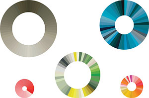
They chose a circular colour palette which created an unending rhythmical cycle of colour. Here are the palettes they chose:
image from dezeen.com
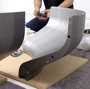
The tables were crafted out of fitted modular segments of aluminium. The shape of each segment depended on the colour the table would be – with the exact contours of the final table being determined by the different tones and shades of the table. Then each segment was anodized to create the correct shade of colour. A craftsman had to stand in front of a vat of die and dip the heated segment of aluminium over and over until the correct shade was achieved, which was a messy and physically strenuous process.
As in the case of the Commonwealth designers, we saw what happens when designers close the gap between their art and the craft of the manufacturer. Barber and Rosgerby shared their appreciation of the craftsmanship involved, and the difficulty in controlling this process.
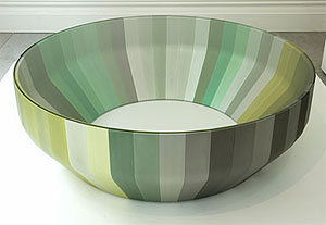
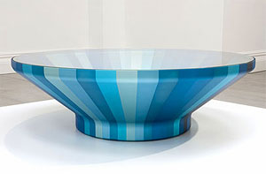
The final tables were covered in a special type of nearly invisible glass. The result is simply beautiful:
image from dezeen.com
image from dezeen.com
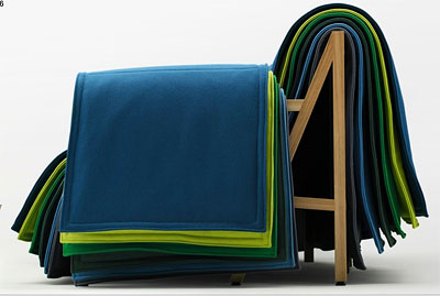
They showed us many projects. But my personal favourite was another example of their enjoyment of using colour. A sofa that is a simple wooden frame covered with a series of blankets to give it shape and comfort. They explained how the blankets had to be a variety of colours for the piece to work. Once again, the satisfaction of combining colour. There is something very attractive and human about this piece:
image from barberosgerby.com









Recent Comments