Some more drawings for my book. The chain was quite tricky – had to redraw it many times.


07 Feb 2012 Leave a comment
in 2 Work in progress, All my drawings, stories Tags: Illustration
Some more drawings for my book. The chain was quite tricky – had to redraw it many times.
02 Feb 2012 Leave a comment
in 2 Work in progress, All my drawings, stories Tags: drawing
There’s something satisfying in drawing a teapot 🙂 Another illustration for my book: done.

30 Jan 2012 1 Comment
in 2 Work in progress, All my drawings, stories
More drawings for my book: I plan to insert small drawings in the scene breaks and at the end of some of the chapters. Here are some rough pencil sketches of a hare, a witch’s tea set, a washing up glove and so on.


30 Jan 2012 4 Comments
in 2 Work in progress, All my drawings, stories Tags: drawing
Another drawing of characters from my book: Miss Mouse against a backdrop of burnt protea bushes. Miss Mouse was not planned. She just appeared and took over in her gentle but insistent way.

29 Jan 2012 2 Comments
in 2 Work in progress, All my drawings, stories Tags: rough drawings
I scanned in the rough drawings I did yesterday and started working on them in Photoshop. As always, cropping conceals a multitude of flaws…
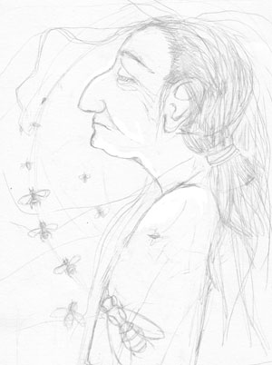
Here are two versions of Helen considering a bee. These are intended for display on a black and white Kindle screen, which is an interesting limitation to work with.


This was the original sketch:
28 Jan 2012 Leave a comment
in 2 Work in progress, All my drawings, stories Tags: witch
I’ve been drawing again (yay!) and struggling a bit to get going. Yesterday I did some very rough drawings for my new book. Here is Miss Mouse:

…and Helen, a witch:
The book itself is very nearly finished. Need to work through it one more time to smooth out the rough bits. The working title is “Dark Sister” but I’m going to have to find something else. Too many other books with that title already!
12 Dec 2011 3 Comments
in 2 Work in progress, All my drawings, Inspiration Tags: 2 Work in progress, Illustration
Possible illustration for my new book – work in progress:

20 Aug 2011 Leave a comment
in 2 Work in progress, All my drawings
A detail of a drawing I’m colouring in Photoshop. Still very rough. It’s very late, the gas heater is puttering away next to me keeping the winter’s night at bay, and every now and then the rats start a little fight under the floorboards. Time to go to bed.

19 Aug 2011 Leave a comment
in 2 Work in progress Tags: reading the tarot, writing
No new drawings, because I’ve been swamped with got-to-pay-the-rent work about which the less said, the better. In the evenings I’ve been working the outline for my new book.
I’m still discovering who the characters are and why they got to where they are. I needed a way to help me figure these things. Problem is, it’s easy to slip into the groove where my main character is, essentially, me. And the secondary characters are suspiciously like characters from my favourite books.
To “throw myself a curve ball” as Brendon says, I’ve been doing tarot readings for each of my characters. This helps me figure out who they are and what they care about. I’m fairly new to reading the tarot. It’s quite a fascinating process. I tend to be a bit skeptical about the mystical side and use it mainly as a tool to help me consider many different sides of a question. But I must admit that I got some pretty uncanny results. Either there is something more going on than I like to admit, or the human tendency to recognise patterns where there are none is even stronger than I suspected.

For example. One of the characters is the “love interest”. He will develop a crush on my main character, although at this stage it is unclear whether the relationship will get anywhere. I asked the question “Tell me more about this young man.” The first card, that stands for “the heart of the matter” and such issues as “central issue” and “outstanding feature” was the Two of Cups. The second was The Lovers. That made me stare.


The Two of Cups is all about attraction, particularly between two individuals, “recognising that a bond is developing”, making an exclusive connection. It is the minor arcana equivalent of The Lovers. The Lovers deals with the urge for union, the strong connection between two people as well the commitment an individual makes to certain beliefs and values. And, of course, sexual and romantic love.
So that was quite appropriate.
The reading I did for my “evil” character was just as apt. Her heart cards were the Three of Swords and the King of Pentacles. The Three of Swords is about betrayal, hurt and loneliness. The King of Pentacles suggests qualities of reliability, competence, the ability to succeed, “working towards a goal with resolve”. Her reading was a study of contradictions. Reconciling these has helped me think about this character in a much more complex way, figuring her out as a human being rather than the symbol of evil she was before I started this process.
Of course, just the act of laying out the cards and looking at them helps me think. Such amazing, potent images.

09 Jul 2011 2 Comments
in 1 My books, 2 Work in progress, All my drawings, stories Tags: drawing
I’m another step closer to publishing my short stories as an e-book. Today I finished the last of the illustrations. These are mostly small, incidental drawings that get dropped here and there between scene breaks or at the end of the stories. To my surprise, not all the stories were easy to illustrate. Not all of them had objects in them suited to this type of drawing. One of the most difficult stories finally yielded this, a haunted office phone:

Then there is this mysterious bottle that a character finds in his garden shed:

Another story features a cat hopefully peering under a fridge:

And here is a flyer for a micro-lending firm that comes to a bad end in yet another story:

I’m tempted to post them all here, but that would make a very long blog post 🙂
My stories have been proof-read and formatted, and when I’ve placed these drawings in the text, I should be ready to publish. Sort of a scary thought!
Thanks to those of you who added your names to my e-mail list to be notified when this book will be available. If anyone else wants to add their names, please use the form below.
24 Jun 2011 Leave a comment
This Sunday we leave for Grahamstown to take my work to the Com/Mix exhibition. I spent yesterday packing my dolls and their glass bottles into heavily padded boxes. For some reason this makes me feel ridiculously pleased with myself 🙂

I still have to pack the framed pictures and oh! Did I mention that the coloured versions of my Antjie Donder and Mevrou Karwatz drawings came out looking fanTAStic? So good that I wish I had them framed. Cant wait to get there to see everyone else’s work .
19 Jun 2011 7 Comments
in 2 Work in progress, All my drawings, stories Tags: drawing
There are worse things than spending a rainy winters morning drawing while listening to an audiobook. I had fun with this drawing too, although it was more difficult choosing the colours for this witch. She is more civilized than Antjie Donder, and needed colder colours.

I cant wait to see these drawings printed. I’m planning to sell digital prints of both the black and white and colour versions at the Grahamstown exhibition. One more week before we leave so I’ll have to get moving if I want to get these printed in time!
Here are some details. The crows were supposed to be the indigenous “Wit Bors Kraai” we get here in South Africa. But apart from not having white breasts, these birds are not nearly bulky enough to be the indigenous kind. I think these crows come from Europe, like their mistress.

I did manage to work in some roses into the drawing. The drawing is based on a story called “Thorn Rose”, so the roses are quite important. Roses and thorns are important, I should say!

18 Jun 2011 11 Comments
in 2 Work in progress, All my drawings, stories Tags: drawing
I finally got round to adding colour to my Antjie Donder drawing. I wanted to use a method similar to a colour lino-cut print; layers of colour overlapping, with the gaps in one colour revealing the colour beneath.

I put a “multiply” blending mode on the linework layer to knock out the white areas but keep the black line. Then I created 10 solid colour layers under it, and used layer masks to hide each layer. Then, I painted with white and black on the layer masks until the whole image was filled with colour. Some of the top layers are partly translucent. I discovered a useful keyboard short-cut: “X” while using the brush swops foreground and background colours. This is great when working on the layer masks because it means you can switch between black and white while you paint.
Here is the (possibly) final coloured version:

Some details:
09 Jun 2011 3 Comments
in 1 My books, 2 Work in progress, All my drawings, books, stories
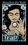
I’m about to publish my collection of short stories as an ebook. It’s been a very interesting process so far, lots to learn. I’ve just completed the cover designs. The stories will be available as bundles of three or four stories each, or you can buy the full collection that includes illustrations.
Designing ebook covers has some specific challenges as they need to read clearly at thumbnail size and also in grayscale , to look good to potential buyers browsing for books on their Kindles.
Here is the cover for the first bundle:

I like the way they look as a set. Here are the rest:
18 May 2011 7 Comments
in 2 Work in progress, All my drawings, stories Tags: drawing
Oof. I’ve finished my Antjie Donder drawing. It’s too large to fit onto my scanner, so I had to stitch it together in Photoshop. I love detail when drawing, but fiddling with digital details just gives me the horries.

I got some suggestions for what to put into Antjie’s pocket in my last post. It turns out that she keeps a candle, some pencils, and what is probably a little bottle of Kloktoring in her pocket.

This drawing has been in my head for years. The imagined drawing generated a story, a doll and finally, the drawing itself.


Recent Comments