The last day of the Design Indaba started with Marian Bantjes who proceeded to make me most uncomfortable. She held out a vision of how life could be that I found deeply disturbing.
Work which is synonymous with love. Drawing and writing, ornament and pattern. And the promise that these are within reach if only one is willing to risk it all.
Marian Bantjes introduced her talk with images of the work that she produced in the first nine years of her life as a trained typographer. Competent and dare I say boring examples of pamphlets, posters and brochures.
Confronted with the thought that in all probability, this was the course of the rest of her life, she says that “I came to recognise my own mediocrity”. And unlike most of us, she acted upon it.
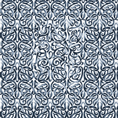
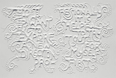
She left her own design firm and “just started making things”. Things like this:
Image from Designboom
She allowed herself to do what she wanted to do, and explore the personal and artistic aspects of her work. For an entire year she made no money. And then – of course – the fairy tale ending. She was commissioned by Details Magazine, and then by Wired. And she never looked back.
Here are all those truths that I try to avoid so that I can continue my daily life. “Its better to work for love than money” and “Nothing is wasted as long as I am making”.
She even said out loud what I have never fully expressed to myself when trying to explain to people why I enjoy time consuming creative processes like embroidering by hand: “Its not patience, its obsession”
Another interesting statement was “I don’t doodle”. Doodling, for her is an unplanned, unstructured activity. Her work, in contrast, is always precise with every aspect carefully considered and refined.
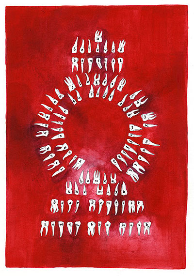
Here are some of a series of work she produced for the Creative Review. They are a series of image-letters to friends and lovers. Here is one to a Dentist:
Image from bantjes.com
The text reads:
“Oh beloved dentist.
Your rubber fingers in my mouth.
Your voice so soft and muffled.
Lower the mask dear dentist, lower the mask.”
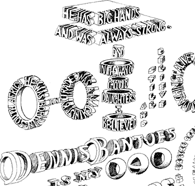
Another one, this time in honour of her father. This is a detail:
Image from bantjes.com
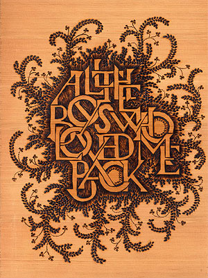
And to all her past lovers, she created this one by scorching marks into wood:
Image from bantjes.com
You can see more images from Creative Review Monograph project at this page
Marian Bantjes typographical art works are often difficult to read. But as she quips – “Its not an emergency exit sign, after all”.
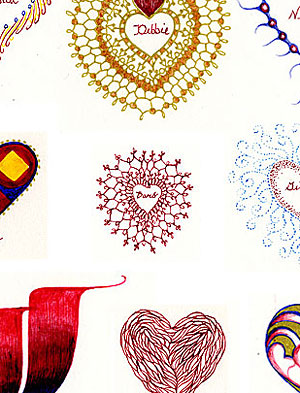
The theme of producing pieces for individual people, touched upon by many of the Indaba speakers, was expressed differently here. Marian Bantjies has a tradition of printing editions of valentine cards to her friends and clients. This time, she decided to hand draw each one of the 150 valentine cards, each one unique:
You can see all the valentines at this page.
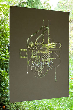
Another project was a poster design for the Academy for Educational Development. The project was to promote the importance of design in development work. This poster was laser cut so that the colour is created by the background to the poster:
image from bantjes.com
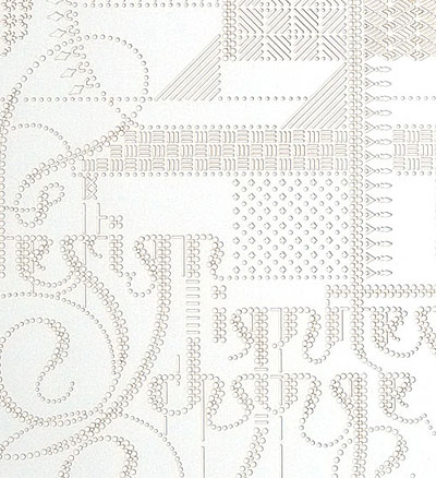
A satisfying detail can be seen on this close up. Apparently the laser process produces small flaring burn marks which are usually kept on the reverse of the work. Marian Bantjes reversed the paper, so that the burn marks are visible from the front. It works beautifully with the text that says “Design Ignites Design”.
image from bantjes.com
You can see more on this poster at this page
Some other works worth showing – poems created in sugar:
image from bantjes.com
You can see more of these sugar poems at this page
Marian ended with her check-list when assessing design work:
“Does it bring joy?
Is there a sense of wonder?
Does it invoke curiosity?
Does it inspire?
Is it unusual?”









Recent Comments