I have a new hero: Michael Bierut. He set the tone for the Design Indaba 2010 with an insightful, witty and inspiring account of how he “almost blew it” on a high-profile project .

It must be tough to speak at the Indaba – you are asked to show off your work to an audience of highly competitive and critical people. It it easy to come over as egocentric or arrogant.
Instead, Michael did what a good teacher does – he reminded us that learning only happens when we reflect on our own mistakes.
He told us the story of his involvement in a project run by the Robin Hood Foundation – the L!brary Initiative. A number of architects had been asked to redesign the libraries of several inner city schools. Michael Bierut was asked to act as the designer for the project.
He shared the mistakes he made:
- I thought I understood the assignment.
- I overestimated the need for control.
- I mistook creating a brand for creating an experience.
- I overestimated the need for uniformity.
- I did not realise how complex the audience was.
He had assumed that the project would be a visual identity – name, logo and so on- and that the challenges would be to work out how to apply these in a standardised way between the different libraries. It seemed obvious that the challenge was to get kids to see libraries – those boring, stodgy places – as “fun”.
As it turned out, the kids in question did not find libraries boring – they did not have libraries at all. The project was a genuine transformation, and not just an exercise in re-naming.
From his initial failed ideas (which he shared with great relish), the project soon became very interesting indeed. A throw away idea to paint a mural in the space above the shelves grew into the most important part of the project. Each library got a unique mural. Each mural was created by an artist, and centred around the kids who used the libraries.
Some murals were photographs of the children. Others, paintings or illustrations. Here is an example created by Lynn Pauley ( You can see bigger versions of all of these by clicking on the images below – all these images from the Pentagram site):
Some were made up out of curious objects, a visual puzzle, like this mural by Maira Kalman:
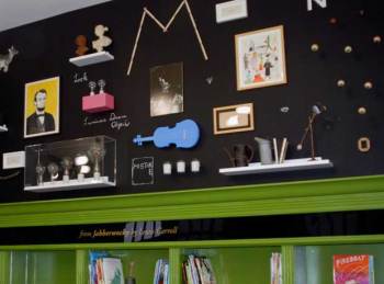
Images based on words by Rafael Esquer:

Illustrations based on interviews with children by Peter Arkle:
I could not find images of them, but there were also murals of poetry written by children, and favorite – a number of speech bubbles with questions that you might find answers to in a library – such as “If chickens had lips, would they whistle?”
So Michael took us along on his journey that started as a single designer asking “what is my role” and ended with a collaboration between designers, artists, children, parents and librarians.
He left us with the lessons learnt:
- Dont be so darned clever.
- You get power by giving away power.
- The real opportunity (in this case, the potential of the murals) may not be part of the scope of the project.
- Consistency does not equal sameness.
And my personal favourite:
- The audience is more wonderful than you think.
Some more information for you –
Here is a video of Maira Kalman’s contribution to the L!brary Initiative:
You can read more about The L!brary initiative:
You can read Michael Bierut on “how to make your client’s logo bigger without making their logo bigger”
Here are a number of Michael Bierut videos on YouTube:
And a video of Michael talking about typography.
And lastly – the “Design Observer” blog.
This post was first published on www.designindaba.com










Recent Comments